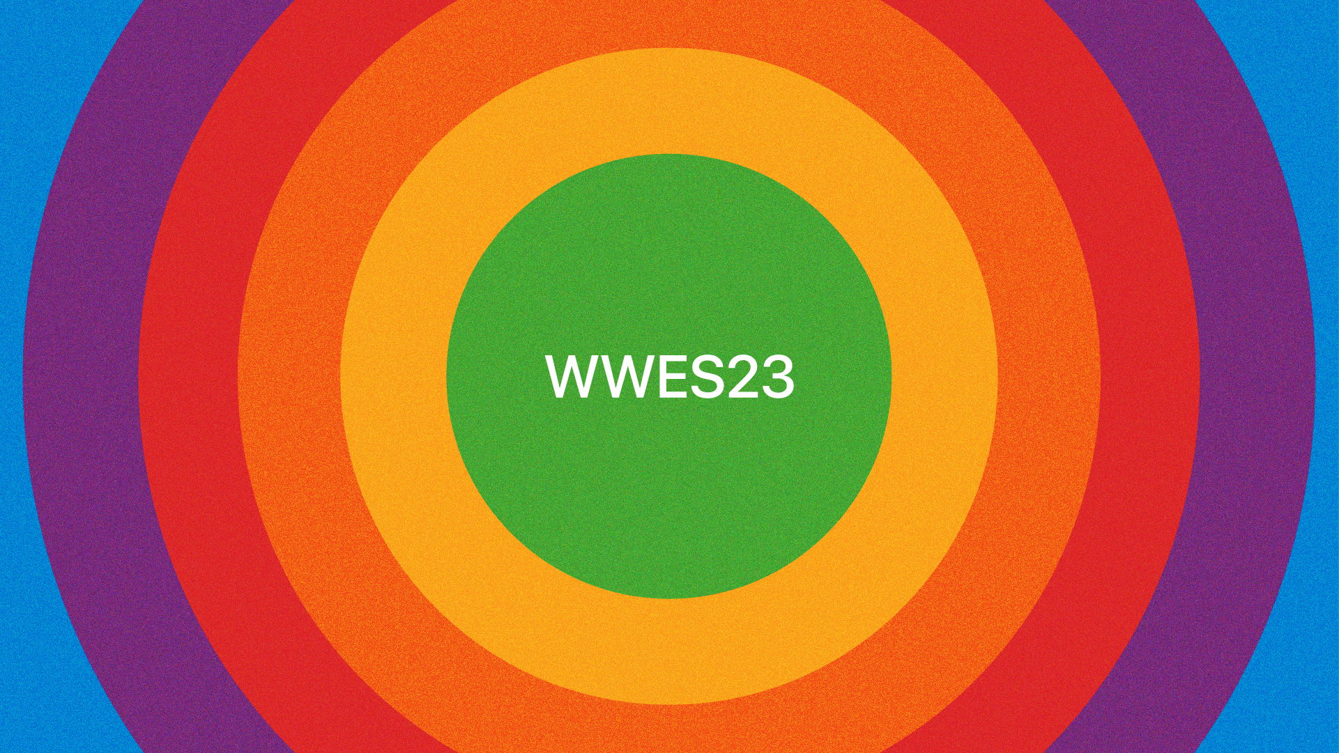
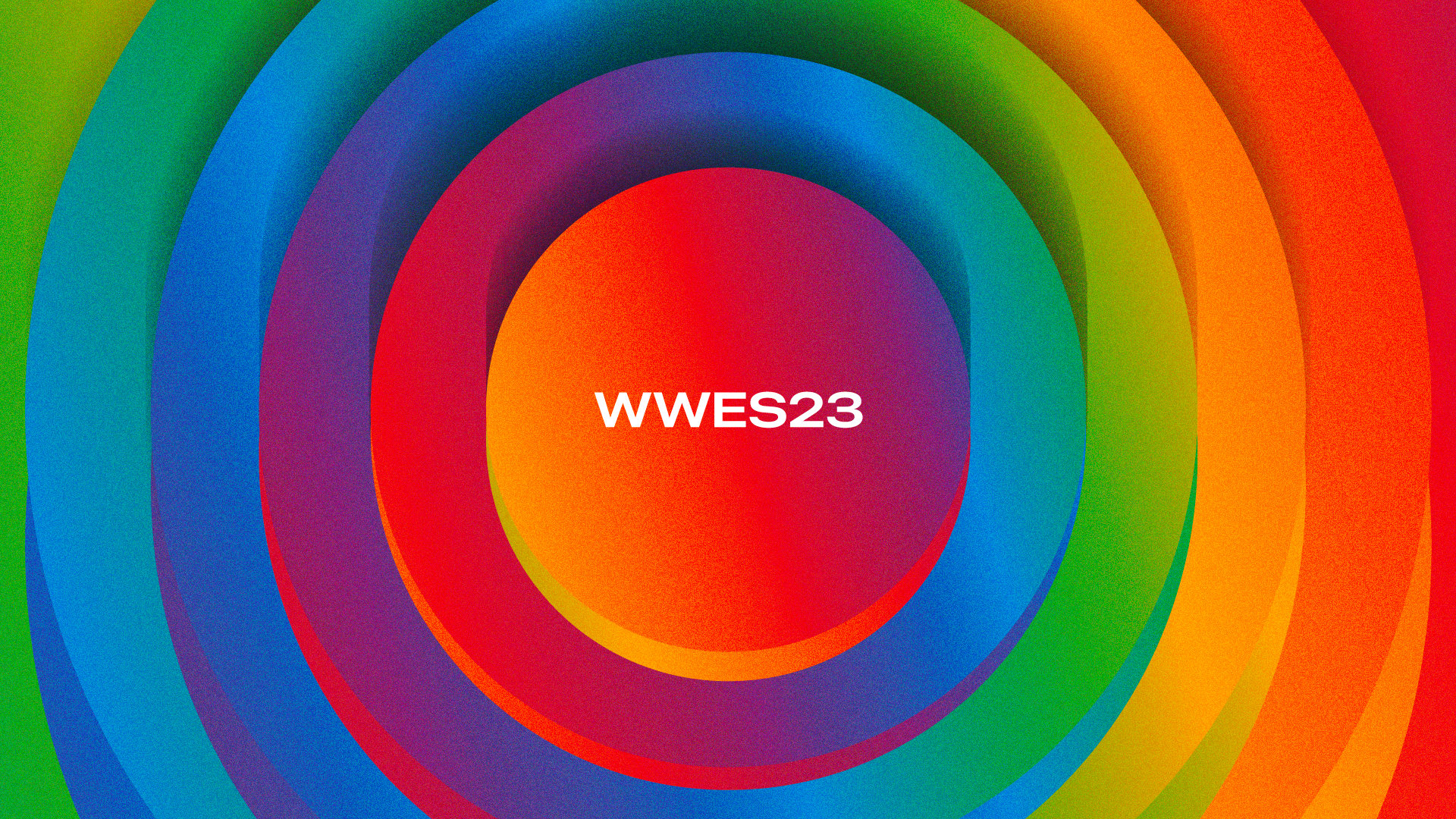
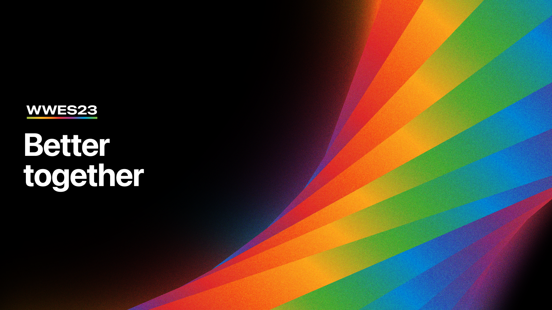
WWES23
With it being my fourth year working on WWES, my team and I really dug deep to make it something special. Working alongside key stakeholders, copy editors, and the video production team, we exemplified the theme of this year’s event: Better Together. In the same manner, designed, and animated the look and feel of the event to show how Apple products are just that.
Key Phrase: Every Apple product serves a unique purpose and functionality, and when combined, creates a more enhanced experience.
Key Words: Individuality, Unity, Strengthen
Responsibilities: Key Graphics, Motion Graphics, Logo
Services
Strategy
Art Direction
Brand Identity
Motion Graphics
Brand Guidelines

The Story
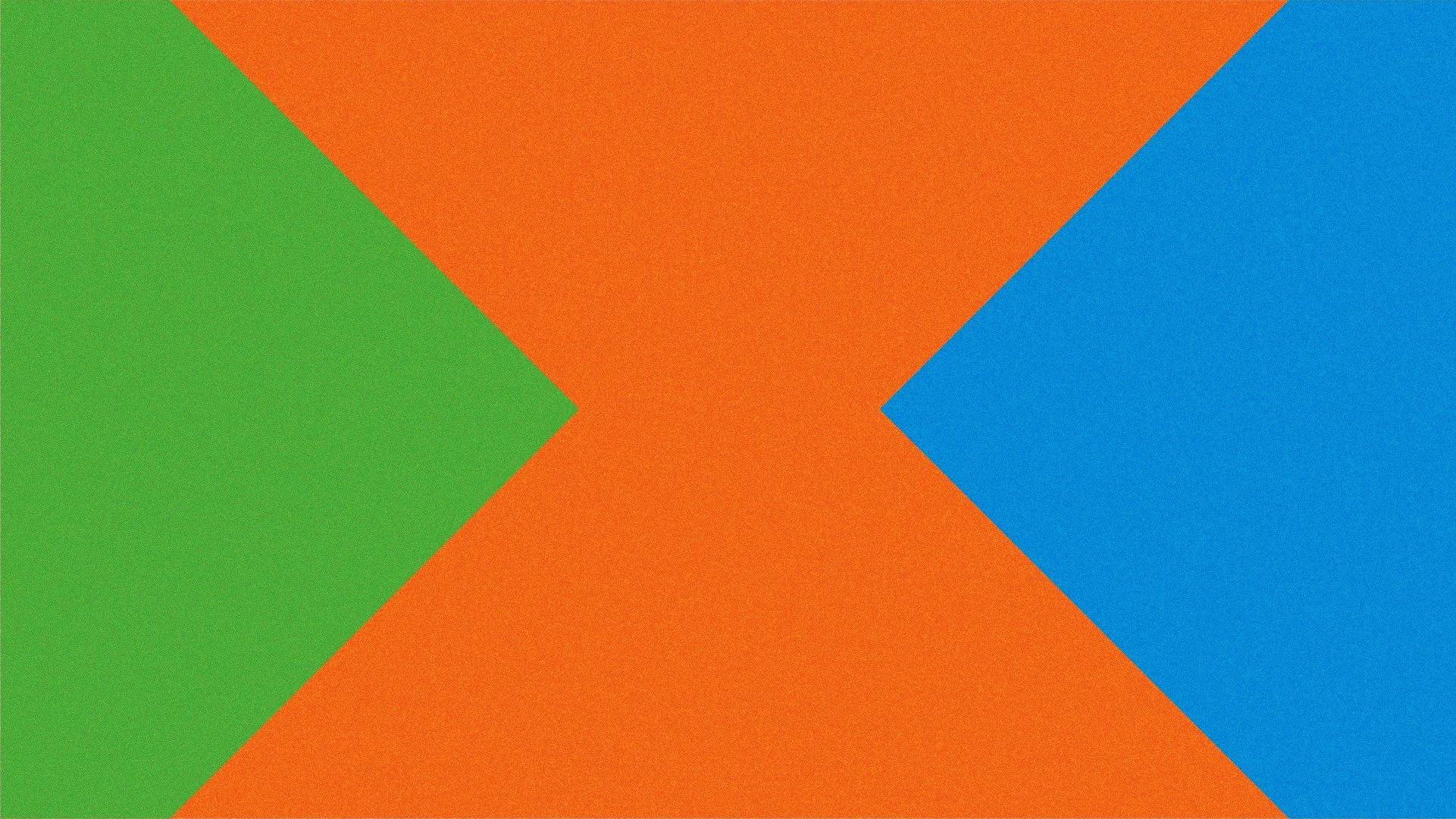
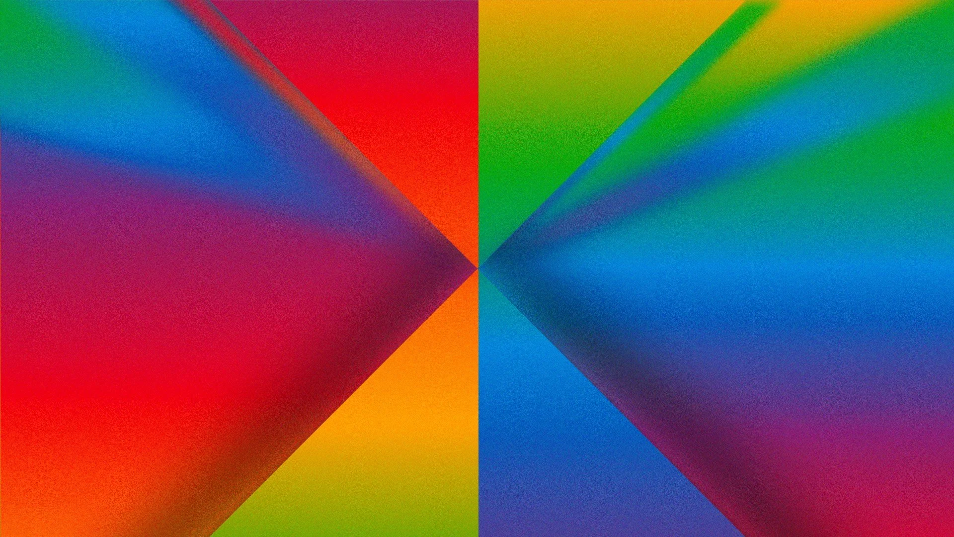
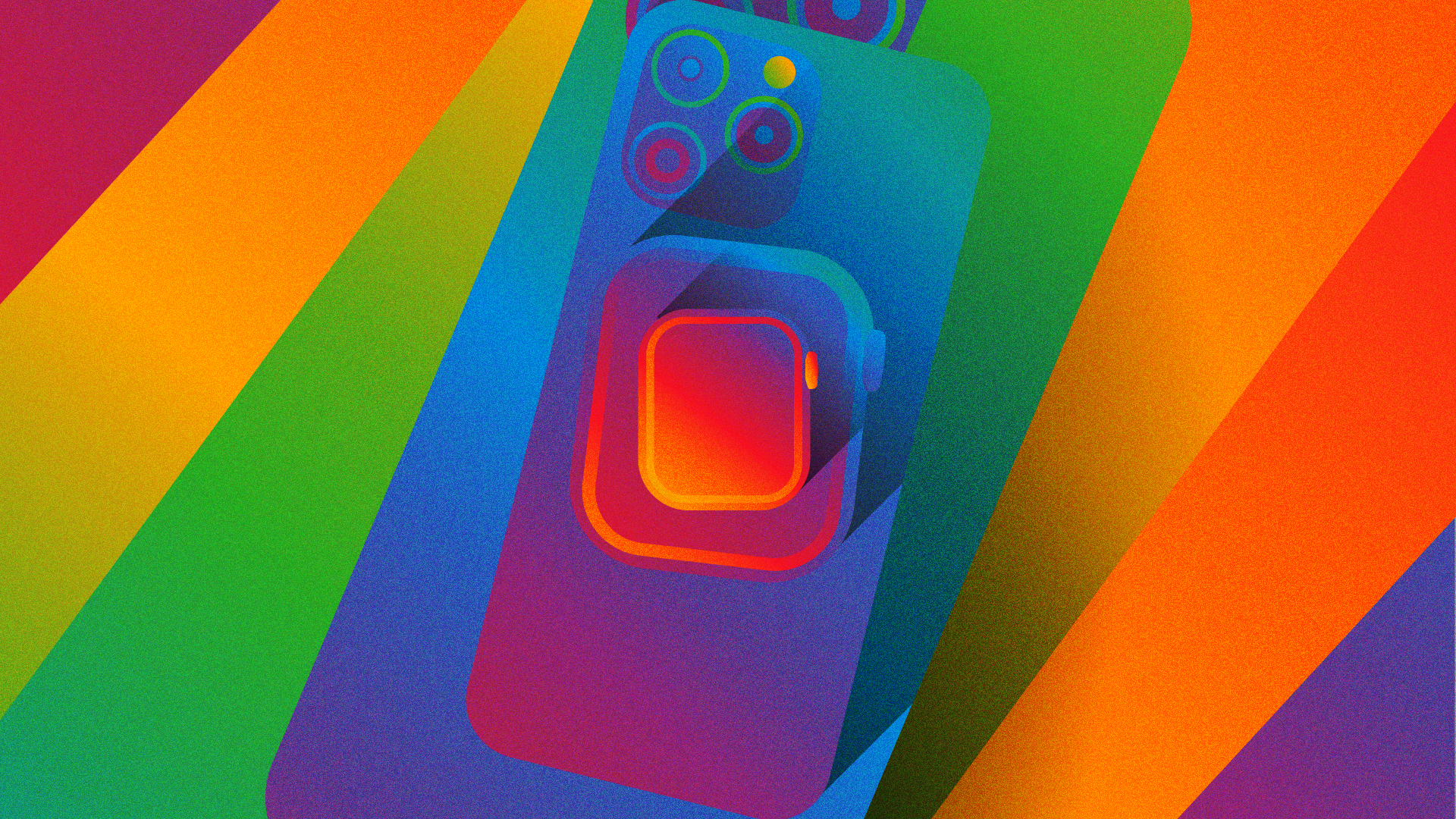
We started with Apple’s rainbow color palette to build on the idea of “Better Together.” Quickly busting out as many ideas as we could, we started designing a million different ways to visualize a campaign brand with a rainbow color palette. We designed so many rainbows I’m pretty sure we could see the end of one.
Finally, I had the idea to visualize the rainbow colors blending into a gradient to visualize the continuity and seamless blending of features within the Apple Ecosystem. From then on out, it was jam time.
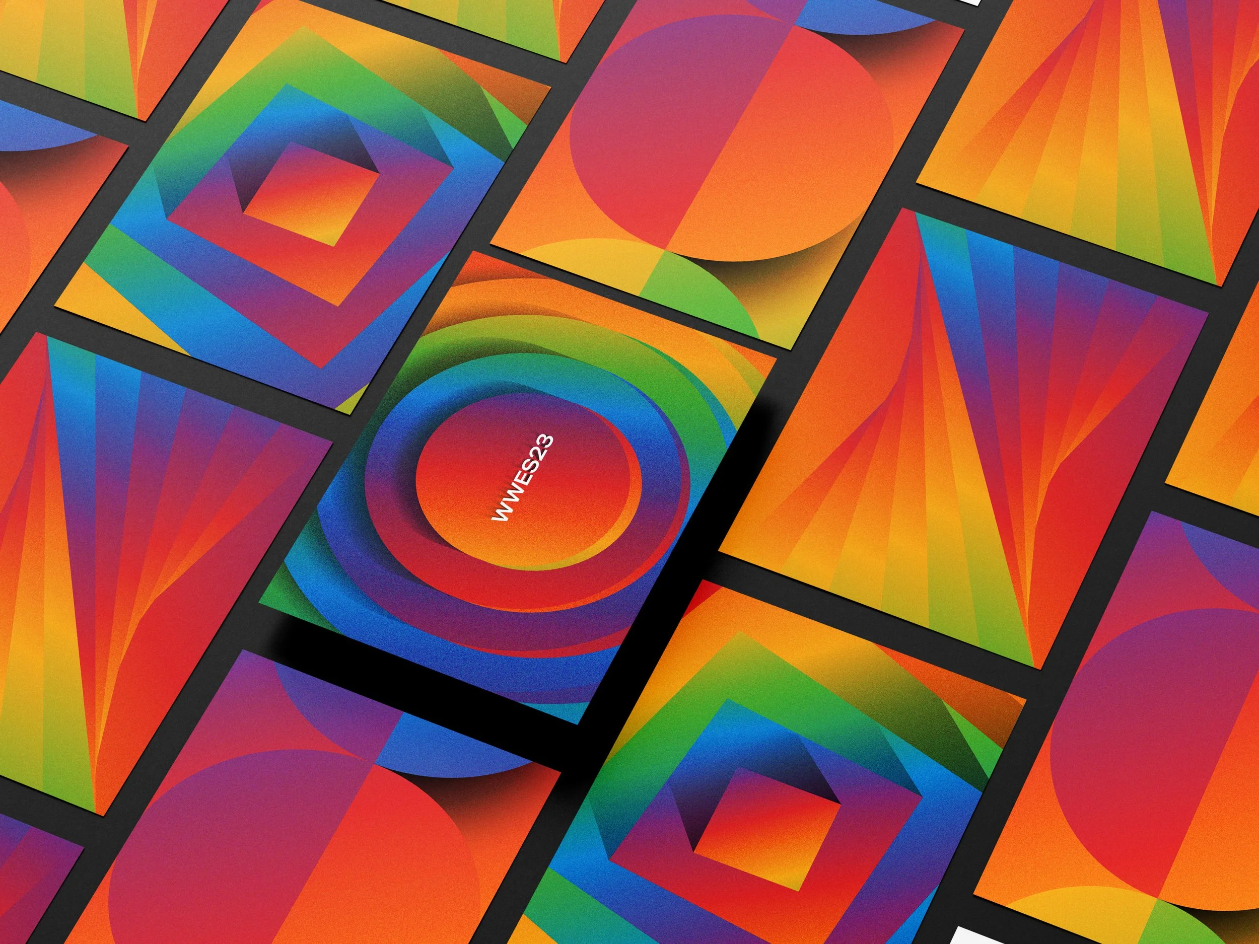
Stories and Styles
I had built the visual style, but needed style frames and key imagery with Apple’s products front and center to help inform the motion graphics video. After drawing some rough boards, I was able to adapt the gradients to incorporate into the products in a meaningful way.

Motion Assist Inbound!
After creating the brand visuals as well as the key motion graphic logo intro, the motion graphics team was strapped for time and needed help with designing and animating lower thirds and video transitions.